Styling Apps
In this post we’ll discuss how you can use typography, color, and layout to create engaging apps that easily communicate your content across desktop and mobile.
Typography
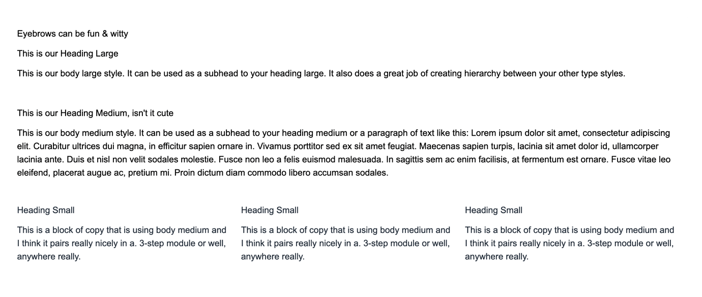
One of the most important aspects of communicating with type is establishing a strong typographic hierarchy. This means presenting the content in a way that visually conveys where to look, and in what sequence. It’s good to remember that the styling of type should guide the viewer through the content in order of importance.
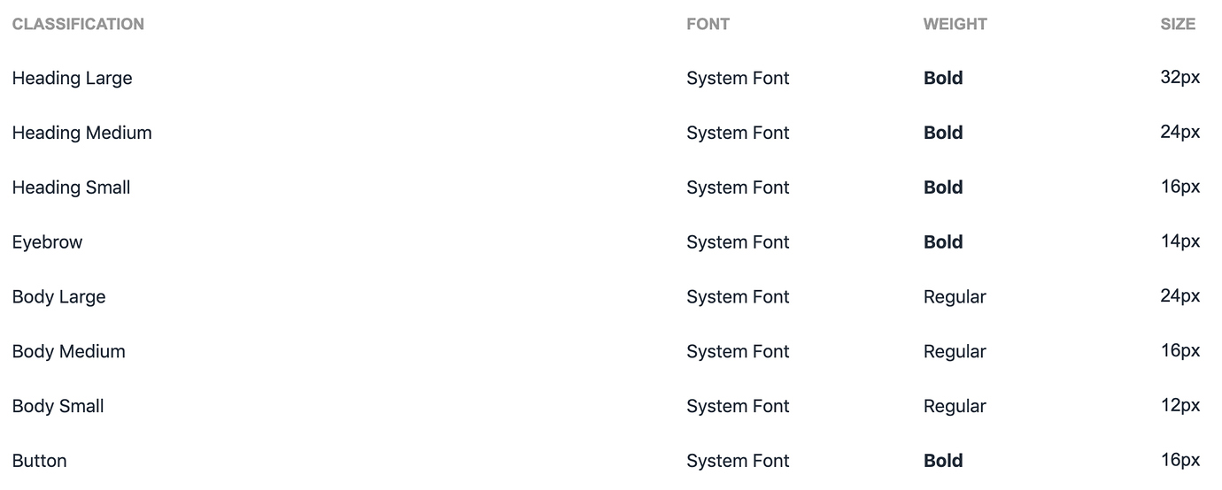
We’ve established some guidelines for how to apply type styles using size and weight (bold, italic, regular) to help create a hierarchy of information and importance in your apps.
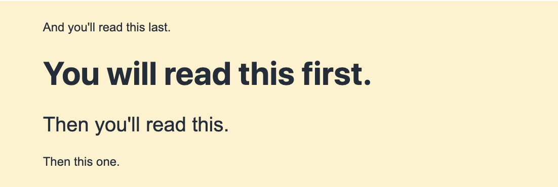
Examples of non-styled type (top) and styled type (bottom) below.
Applying type styles
For apps in Honeycode, the default font is 16px regular. To apply new styles, simply select the object you want to change. Head to your toolbar and select the desired size and weight. You’ll instantly see the style change reflected in your app. For readability across mobile and web, we recommend keeping body text at a minimum size of 16px.

Color
Color is arguably one of the most important aspects of your app. Color helps users see and interpret your app’s content, interact with the desired elements, and understand what to do.
We’ve established some guidelines for how to apply color that ranges from deep and dark to light and airy to help set the tone for your app and draw focus where you need it most.

Applying color styles
To apply color styles, simply select the app object you want to style, and from your toolbar select the bucket icon. There is a menu of colors to choose from, so we suggest being mindful of a color theme (like above) to help establish consistency across your screens.

Primary & navigation
You’ll want to highlight the main areas of focus, from the top navigation in your desktop view to your header and global navigation in your mobile view. This bold blue color guides the app user’s eye down the page and to areas of focus, such as buttons.
Secondary
The secondary color is meant to highlight any area that doesn’t warrant immediate focus. Notice how this color doesn’t compete with the primary color.
Text Color
You’ll want to ensure that your text is legible in your app, so we suggest selecting a color that has a high contrast against your background colors.
Background Color
It’s best to choose colors that allow your text color to be readable, think light with dark text or dark with light text.
Errors
Use this sparingly, as alert text or cancel buttons, for example.
Buttons
Buttons are simple. But, in order to define success for buttons, you’ll need to establish some hierarchy. Much like we’ve discussed with color, it’s best to follow the same rules to establish patterns and consistency in your apps.

Borders
Borders can be added and styled using the toolbar to enhance visibility of blocks, segments, buttons, and content boxes. This includes color, location, thickness, and corner radius.
Layout
Layout refers to the arrangement of elements on a page usually in regard to specific placement of image, text, and style. In this section, we'll cover ways to use space and grids to help you create the most optimal layouts for your apps.
Grids
Honeycode is built on a 12-column grid. This gives you a lot of flexibility to build various layouts that work within this grid. We've provided a few examples below.

Below is an example of a 3-column layout:

Space
Space can create a sense of separation between elements that make a design more visually appealing and usable. For example, space is the margins, line height and word spacing of text. Below is a starting point of how our team builds apps with space and the way they do it. While we currently don't offer spacing in our menus, we've found ways to leverage tiles and rows to give us the perfect amount of space to make our apps just right.
Adding empty space to your screens
Honeycode mobile apps automatically include horizontal and vertical margins of 8px on blocks, buttons, and lists to make it easier to interact with different portions of the app.
In order to add space to your screens, you’ll need to insert a segment (which contains a box). Then, change the size of the type to 8, 16, 24 or 32, depending on how little or large a space you want to create. Type something in the content box, like "empty" for example, and change the type color to match the background color.

While this isn’t the most optimal way to add space, this is an easy hack for creating beautiful layouts that allow the information to breathe.
Builder's tip: Want to learn how to change up your app's appearance? Check out these styling basics.
| Was this article helpful? |
|---|
- Yes
- No
0 voters