Honeycode has two types of toggles you can easily add to your apps to allow users to make a selection with a click or a tap:
- Checkboxes
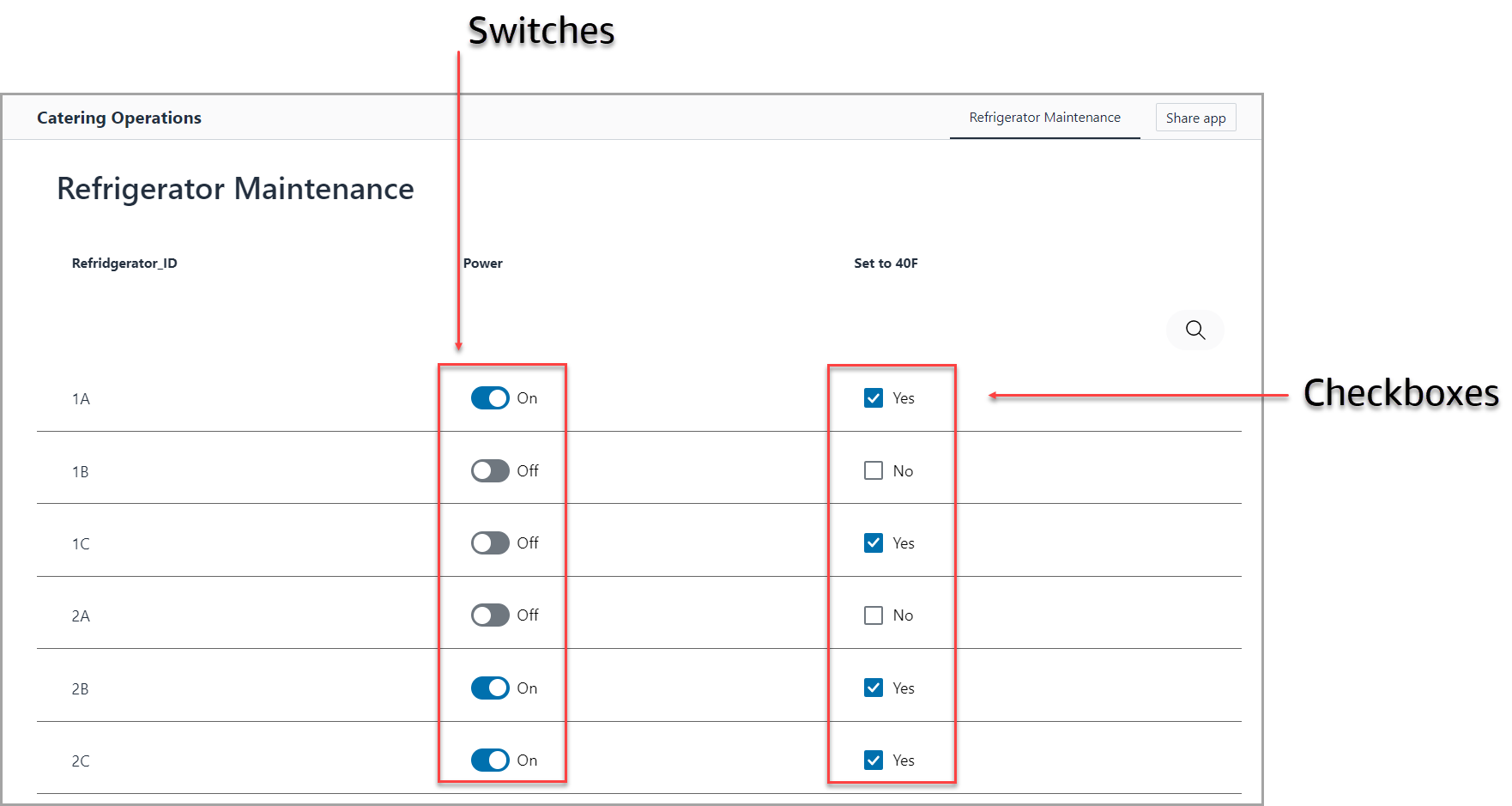
- Switches
Toggle selections are typically binary in nature, meaning the app user can select between two choices; furthermore, you can add dynamic labels to the toggles to help clarify what the selection means (e.g., On or Off, Yes or No, Complete or Incomplete, etc.).
Use case with steps
As seen in the image above, we will build an app for a catering company’s maintenance team that performs refrigerator checks prior to events to ensure they are powered "On" and set to 40°F.
-
Switches will be used for the On/Off Power selection. Switches are common and well suited for On/Off selections in app design.
-
Checkboxes will be used for the Yes/No Temperature selection. Checkboxes are an optimal interaction in app design for Yes/No selections.
Set up the tables
- We set up a
Refrigeratorstable with three columns: a[Refrigerator_ID]column for keeping track of the refrigerators, a[Power]column for the On/Off switches, and[Set to 40F]for the Yes/No checkboxes.

-
We added
TRUEandFALSEvalues to the[Power]and[Set to 40F]columns, which might seem peculiar. After all, when thinking about whether or not the power is On/Off or if the temperature is set to 40°F, words likeTRUEandFALSEmight not come to mind. We are usingTRUEandFALSEvalues because Honeycode’s toggle features use what is called Boolean logic. If you don’t know what Boolean logic is, don’t worry. Just know that theseTRUEandFALSEvalues determine how the checkboxes and toggles are displayed to your app users:-
TRUE: Checkbox will be checked; switch will display a blue, on position. -
FALSE: Checkbox will be unchecked; switch will display a grey, off position.
-
Builder tip: If you prefer to have checkboxes in your tables as opposed to
TRUEandFALSEvalues, select the column > click the Formats button > switch the dropdown from Plain text to Checkbox.

Add switches to the app
- In Builder, click [+] Add object > select Column list. We added all three columns, so the app user can see everything on one screen.

- With the column list selected, click [+] Add object > select Switch. We aligned this with the
[Power]column, and set the shared data source to=[Power]in the Data tab of the Properties panel.
TRUEandFALSEvalues or checked and unchecked boxes immediately update in the table.

-
Optional step: If you want the switch to dynamically display descriptive labels next to the toggles as your app users click or tap, you can add an
IFformula to the Display data from in the field in the Display tab of the Properties panel. We added the formula=IF([Power], "On", "Off")as shown below.
Formula breakdown:
=IF([Power], "On", "Off")
- The
IFfunction uses Boolean logic, and we've instructed it to look at the[Power]column. If the value in the[Power]column isTRUEor a checked box, then the switch should show the word “On” alongside the blue, on position. If the value is notTRUE(meaning it’sFALSEor an unchecked box), then the switch should show the word “Off” alongside the grey, off position.- This formula can be replicated for your own use case by substituting the bracketed column reference and words in the quotation marks.

Add checkboxes to the app
- Select Checkbox from the objects panel. We aligned ours with the
[Set to 40F]column, and set the shared data source to=[Set to 40F].

-
Optional step: Similar to the switches, we added the formula
=IF([Set to 40F]), "Yes", "No")to the Display data from field in the Properties panel. When the temperature checkbox is checked and its value in the table isTRUEor a checked box, it displays the word "Yes." When the temperature checkbox is unchecked and its value in the table isFALSEor is an unchecked box, it displays the word "No."

-
You can delete the content boxes above the toggles if you don’t want the app user to see the
TRUEandFALSEvalues in the app. -
Click the View app button to see your toggles in action.

| Was this article helpful? |
|---|
- Yes
- No
0 voters