Intro to Builder
Honeycode’s Builder is a dynamic, elastic, and oh-so-customizable tool that transforms your table data into interactive mobile & web powerhouses. You can make apps to manage your work and team, from a simple form to custom project trackers.
You can use Builder to:
- Create & style app screens for mobile & web
- Add data , logic, and customization to your app
- Personalize who sees what and when
- Automate workflows and projects
Take the tour
You can access the Builder anytime from inside a workbook. In the left navigation bar, click on the icon labeled Builder. Click the [+] to create a new app, or click any app in the list to edit your app in the Builder.

Now you’ve opened the Builder, let’s get to know your tools and where they’re located.
- Use the top toolbar to style your screens and view your live web app
- The central screen editor is where you’ll design your layout and add app components
- Customize data and automate tasks in the properties panel on the right
- Connect data with the data view below, or simply view your source table
- The screen list on the left is where you’ll manage your mobile & web screens

Screen editor
This is where your vision takes shape. You can easily resize, drag, and add app objects to create a layout that’s just right for your project.
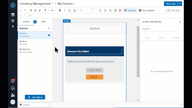
Add an object to begin app building. Objects are the components that make up your app screens that define your layout and data.
You can insert objects into your app screens in three ways:
- From the Builder start screen , as shown above.
- From the "Insert" icon in the toolbar.
- Or, you can right-click in an app screen and select "Insert."
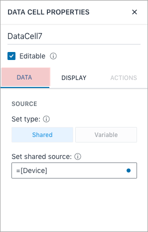
Properties panel
The properties panel, which opens from the right in Builder, is where you’ll configure and edit your app objects. Objects have three main properties: data, display, and actions. Let’s dig a little deeper into each.

Data properties
Located under the “Data” tab, data properties let you customize define what data is displayed. The data properties will change dynamically depending on the object selected. For example, properties for a data cell will guide you to configure your data specific to that object’s function.
Display properties
Display properties allow builders to customize how and when data is displayed. Dependent on the object, data formatting, visibility, and personalization are all properties that can be configured under the “Display” tab. By default, all objects and their data are visible to all app users.

Actions properties
Located under the “Actions” tab, actions properties allow you to automate actions that run when an app user taps or clicks on an app interface. Automation actions include, email notifications, in-app notifications, data manipulations, and navigation. For example, when a user hits a button they’re navigated to a new screen.

Data view
The data view provides a quick and easy way to view table data and add it to your app. By default, the data view is collapsed when you enter the Builder. Clicking on the expand/collapse double chevron in the bottom right will open the data view. Use the table picker to switch between table views. Simply hover over columns or cells and click to add data to an object.

| Was this article helpful? |
|---|
- Yes
- No
0 voters