Intro to the app editor
Honeycode’s app editor is a dynamic tool that lets you customize the template for your app users to interact with. You can make apps to manage your projects and your team's productivity. In this article, we’ll use the Inventory System template to introduce you to the app editor and review some of its capabilities.
You can use the app editor to:
- Add and customize what fields show in your app
- Control when fields show and how
- Create & style app screens for mobile & web
- Automate your team’s workflows
Access the app editor
As an app owner or collaborator you can access the editor from inside the app. In the top Honeycode bar, click on the Edit screen button. For more on app owners and collaborators, see our article that discusses Honeycode access levels.

Now that you’ve opened the editor, let’s get to know your tools and where they’re located.
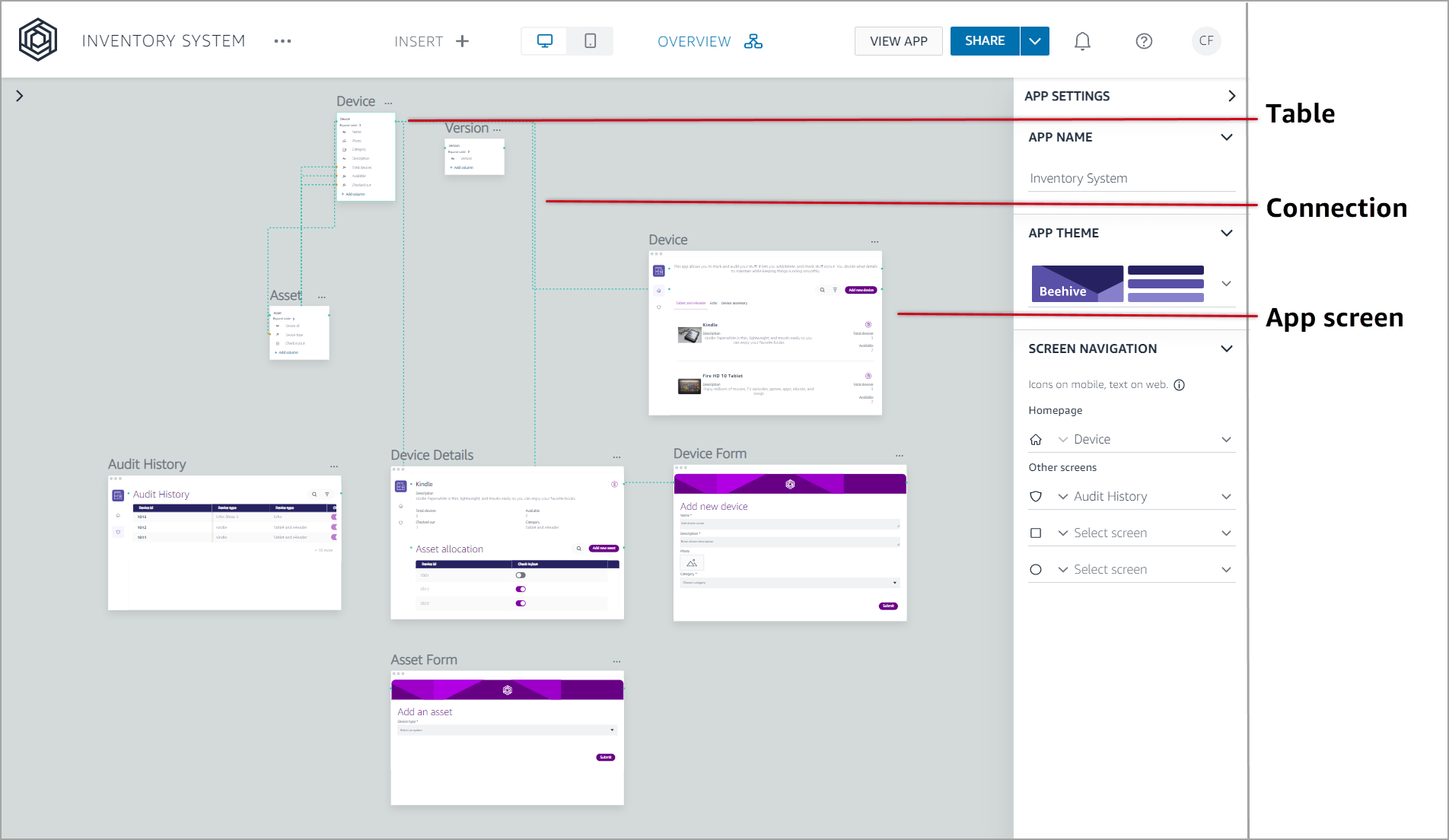
Tour the app editor
This is where you take a template and make it your own. You can quickly add, remove, and move fields on your app screens. You can also change the layout, choose a theme, and more. Let’s take a closer look at the app editor.

-
App screen list - here we list all screens that make up your app. Those with icons represent screens listed in the app navigation bar. The screens without icons are not featured in the app navigation, instead these screens are accessed from within another screen or through a button. For more on the screen types used in Honeycode see our managing data article. Select a screen to see and edit it in the center pane, called the screen display.
-
Screen display - this center pane shows the layout of the selected screen. Screens are made up of one or more components, or blocks of fields. As you float your cursor over a field, all fields of that type highlight on the screen. When you click on a field, the properties panel updates to show what you can customize in the selected field.
-
Properties panel / app settings - this panel dynamically changes to give you access to edit the different areas of your app, including the color scheme, screen navigation, screen layouts, and more.
How to edit overall app settings
Overall app settings are things that apply across the entire app as opposed to more granular, screen or component specific settings. For example, you can set your app name, how your app looks, and how your app users navigate through top level screens.
To update app settings:
-
Click into the gray area surrounding the screen display. The properties panel updates to show the app settings.
-
Here you can change:
-
App name - Use a short, but meaningful name.
-
App theme - Try each of the color themes to see which works best for your team.
-
Screen navigation - You can change screen icons and select which screens show in the app navigation bar.
-

How to work with app fields
Our app editor simplifies updating app screens to meet your teams’ needs. To begin, select a screen in the app screens list to bring it into focus in the screen display. We’ll start at the top of the app home screen and work our way down to help you become familiar with Honeycode’s editing capabilities.
Each of our templates opens with a home screen, where a display field helps explain what the app is intended to offer. You can customize the information here to help your app users and even change the appearance of text in the field to make it more or less prominent.
To edit the display field:
-
Click into the display field. The blue border indicates the field is selected and the text field edit box opens.
-
Use the text field box to update text to meet your needs.
-
After editing, click Save.

To change the appearance of the display field:
-
Expand the Appearance option in the app settings panel.
-
Select a different style. Try these out to find the one that works for you.

Update screen layout
You can update the spacing in components on your app screens and meaningfully group information using the Appearance section of the properties panel.
You know your app users better than anyone, so Honeycode gives you the option to update text spacing to meet your teams’ needs. As with choosing a color theme for your app, try each of the styles to get a feel for how the screen changes.

Grouping information helps your app users focus on what they need and quickly navigate without using search, filter, or sort. Our Inventory System template groups the home page by category.


To add or remove grouping:
-
Click the down-arrow under Group by.
-
If adding grouping, you can choose which options are grouped and set the display order.
Update available fields
It's important to think about your app user's experience. For example: 'What data is relevant to them? What do they need to see and where is the most sensible place to see it?' Asking yourself and your app users these questions will help you build a seamless and snappy app experience.
Honeycode strategically shows a variety of fields, held in components, on different screens. The app home page generally holds a small amount of high-level information, leaving more screen space to list out the options. To see more details, app users click on an option, where more information is displayed and users can update entries, if enabled. Finally, form screens offer your app users the chance to add new items to your app using the same fields.
Working between the screen display and properties panel let’s you customize what fields show where on a screen’s component.
Control what data shows in a field
-
Click into a field on the screen display to activate the field configuration.
-
In the field configuration, set:
-
Field name - Use a short, meaningful label name. The field name displays in the screen.
-
Show as - Various options are available based on the field type you selected.
-
Allow editing - Toggle to allow/restrict your users from editing of the field contents through the app.
- Advanced options - Set the placeholder text that guides your app users on what input is expected in this field. You can also set conditions on what can be entered in the field.
-
Hide when - You can automatically hide the field from the app user’s view based on conditions you set. We call this conditional visibility. See our Conditional Visibility & Styling article for more details.
-
Conditional styling - You set fields to display in certain colors to help draw your app users. See our Conditional Visibility & Styling article for more details.
-
To change field placement
-
Click into the component to activate the properties panel where you'll work in the Fields list.
-
Click the down-arrow for the desired field. All currently available fields are listed, plus you can add new fields
-
Select an existing field to show here.
-
Use + Field at the bottom to add a new field. Adding a new field here also adds it to the underlying data tables, making it available across your app for use.
-
-
Once the field is selected, the field configuration opens.
Note: If an existing field shows elsewhere in the same component, this action moves the field to the new location and leaves to old location blank. Blank fields show in the fields list as + Field.
To leave a field blank
-
Click into the component to activate the properties panel where you'll work.
-
Click the down-arrow for the desired field. All currently available fields are listed.
-
Select Unmap field. The field changes to + Field.
Automate your workflows
Actions in Honeycode are designed specifically to put repetitive, manual tasks on autopilot, while keeping your team in sync. For details on using actions in your apps, please see our Put Honeycode on Autopilot with Actions article.
These actions include:
| Action | Description |
|---|---|
| Notify | Automates the manual task of sending emails to colleagues. |
| Add record | Allows your team to add new data to your app. |
| Delete record | Gets rid of data that has run its course. |
| Update record | Ensures your app has the latest and greatest. |
| Navigate | Makes your app come to life by seamlessly moving from screen to screen. |
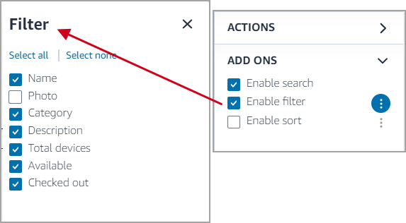
Configure search, filter, sort
You get to maintain control of what your app users can search, filter, and sort by. Apps that contain large numbers of entries can be difficult to navigate. Honeycode templates offer your app users the ability to search, filter, and sort through the entries.
To update these capabilities:
-
Click into the main screen component.
-
In the properties panel, expand Add ons at the bottom of the list.
-
Here you can change the settings to disable or enable search, filter, or sort. Filter and sort let you select which fields of the app can be filtered or sorted by the app users.

Bring it all together
While your team will use the app to access and edit data, you have another layer in Honeycode where you can view the data, plus you get to see your entire app and its underlying data at once. The overview mode provides a quick and easy way to view table data and bring it into your app.
See our Managing Data in Honeycode article for details on accessing and working with data.
| Was this article helpful? |
|---|
- Yes
- No
0 voters