I there any way to create a master detail screen, that shows a simple Stacked List on one side (Maybe 1/4 to 1/3 or the screen) and a Form on the other? This is a fair common design pattern in desktop, mobile tablet apps and I am not finding a way to to do it. An email program is a good example, but it is useful for all sorts or apps. I would think you would need to unlink the web from the phone/mobile screen for this to be useful.
1 Like
Lists have to be full width. You can stack them vertically, though... with the form either above or below the list.
Hi @Vinced4282,
Welcome to the Honeycode Forum.
You can create a Master-Detail screen, but not necessarily side-by-side at this time. I will let our product team know about this request.
A good example of the Master-Detail screen is in the Field Service Agent template. In the AnyCompany HVAC app, there is a Customers Detail screen that can be accessed from the Customers menu, and selecting a customer. You will see the Customer record on top - Name, Contact information. Below the Master record, you will see the list of Properties and the list of Work Orders details for the specific customer.
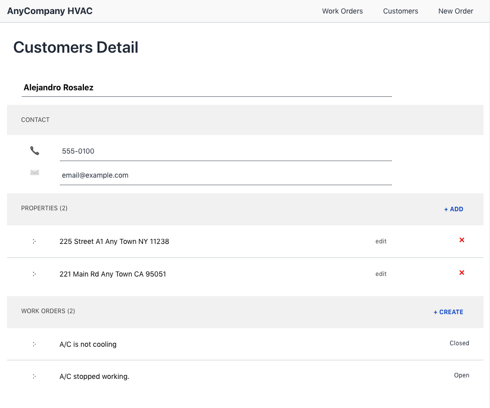
You will see the $[Customer] is bound the parent (master) block and in this example, is passed to the page when a row in the Customers screen is selected.
The two lists below are bound to $[Customer][Properties] and to $[Customer][Work Orders] - where the Properties and Work Orders are columns in the Customers table - and contain a filter of the 1-Many mapping between customers and properties and work orders respectively.
Hope this helps.
Thanks,
Razi
1 Like
Razi
Thanks for the response, and yes your example file does solve the problem of how you show related items (like on the lower right side of my attached image) once you have selected a detail object. The Master Detail I was referring to was more on the lines of this:

The Master Detail screen pattern is isn't as helpful when you are using a phone (hence the reason Apple only uses it on the iPad version of mail), but on a tablet or desktop, it is. To give you some background, I work at a custom software dev house that has been around for 30+ years and most of our mobile apps have been deployed on tablets, because the density of data overwhelms the small phone screen.
Thanks and cool product so far.
2 Likes
Thanks @Vinced4282 for the details and the screen shot. I have added a request for our product team to review for future consideration of a side-by-side layout.
While the side-by-side layout is not possible today, you can still "select" an item by changing the Data Cell to be a dropdown. I made two changes to Customers Detail screen to accomplish this.
#1. I changed the yellow block to make it visible by setting Visibility to TRUE on the Display tab of the block.
#2. I changed to Customer data cell to be Editable. This will change this to be a dropdown to allow selecting of the customer.
After doing this, I was able to select the customer to display details about the customer and the details.

Again this is not exactly what you are looking for in a side-by-side layout with selection in the left pane and showing the details on the right - but it is achieves the goal of selection displaying the record and its child records.
Hope this helps.
Thanks,
Razi
2 Likes
This topic was automatically closed after 14 days. New replies are no longer allowed.