Hi @San,
Thanks for this post too!
In regards to having a sticky / fixed elements on the screen when you scroll, this is a feature that has been requested before to our team. I'll pass on to the team your interest and feedback on this as well for the team to evaluate.
I'll also pass along how buttons in the header does not allow for adjustments on the Display or Data properties, as an improvement request to possibly allow that.
For your particular example, to save space on the screen, perhaps you could have just one error message that says something like: "One or more of the mandated fields are empty", which displays based on the validation of all fields. I.e. with a visibility formula like: =OR($[Assignee]="", $[DueDate]="", $[Status]="", $[Priority]="")
Another idea for longer forms, would be to break them into sections that can show or hide form input fields on the screen based on clicking content boxes or buttons. For example, here's an app I made that demonstrates this concept:
In this app, if you click on "Section 1" or "Section 2", it will display or hide questions in that section. Clicking on section 1:
Clicking on section 2:
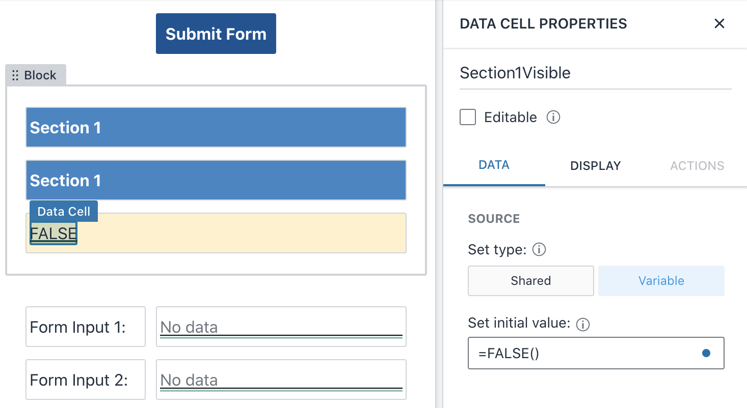
And I set this up by creating a value called $[Section1isVisible], which is switched to true or false based on clicking the Section content box:
The click action on the content box updates $[Section1isVisible] to True:
And the elements in this section are visible based on that value. So for example, this is what I entered in the visibility formula for that block:
The copied Section 1 content box also displays when clicked (has the same visibility formula of =$[Section1Visible]), and its automation would be to set the value back to false (to hide the questions in the section).
I hope these ideas help with reducing what's displayed on a screen. Just ideas to explore. 
I'll still be passing along those two feature / improvement requests you've noted. Let us know if you have any other thoughts around this.